
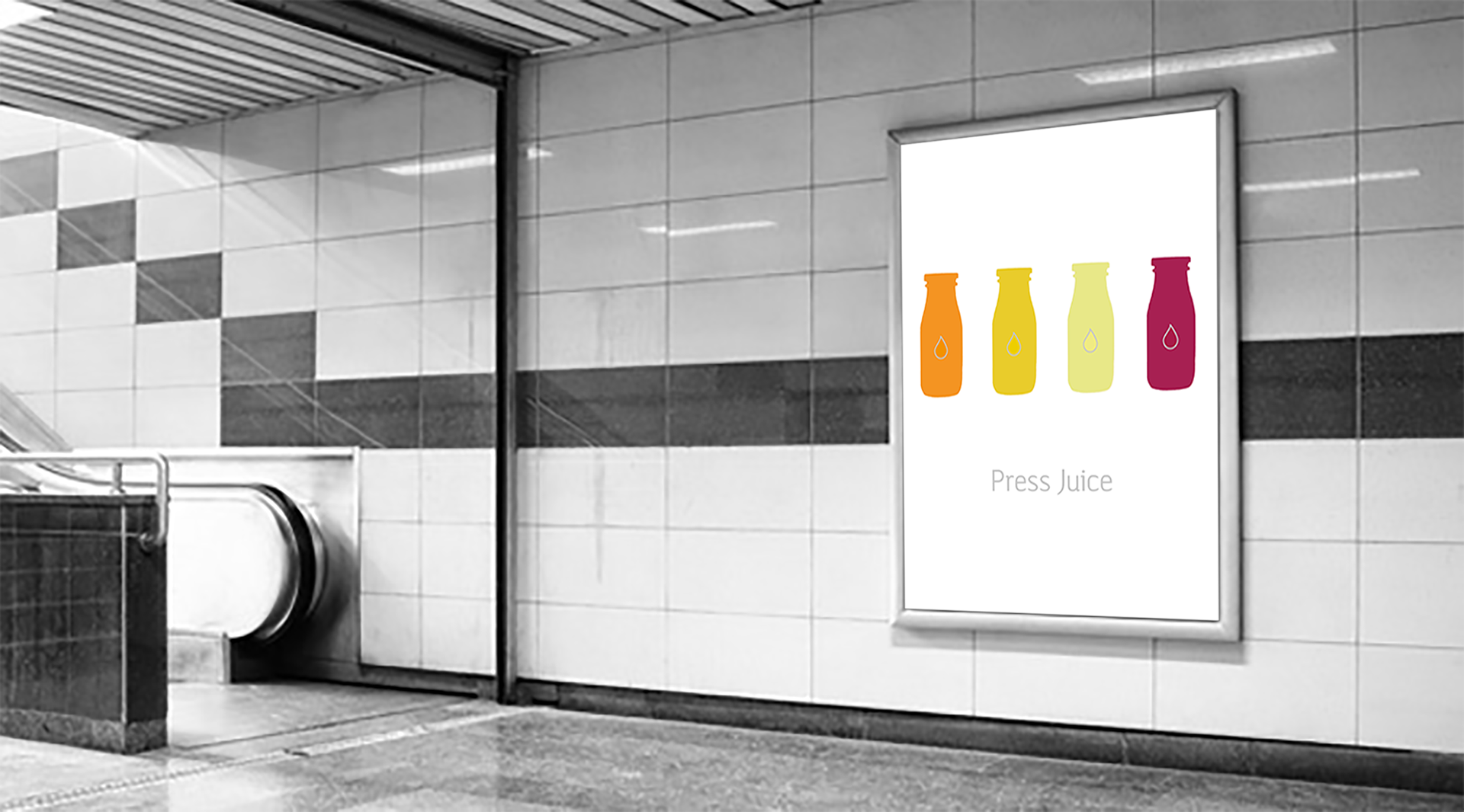
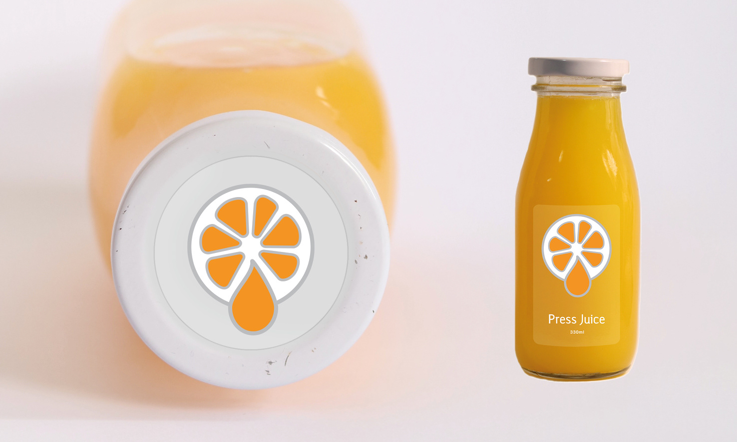


a personal project for a new juice label to break out into a highly saturated market. The brief for this project was to differentiate Press Juice: I took a minimalist iconographic approach to retain consumer confidence and trust in a new label, but also to bring a unique identity in the heavily typographic-based branding across the juice market. This was to create a universal language while communicating the quality and honesty of the brand and juice products